Services
UX/UI
Client
Steve Grant
Year
2020
Project Description
Prefix combines modern credit industry technology with the power of cloud-based web services to reshape public financial benefit and healthcare programs and serve vulnerable populations. Simply put, it is an eligibility platform to apply for, administer, and distribute financial aid to those in need. I was asked to evaluate one of their existing eligibility websites for a COVID-19 related assistance program (Wildfire) and create an improved model based on my research. In addition to conducting research, I restructured their information architecture, incorporated visual design elements into the product, created wireframes and developed/tested a mobile prototype.
The Challenge
The main project requirement, as requested by Prefix's leadership team, was to make the website ADA compliant and adhere to the WCAG 2.1 guidelines for web accessibility. Prior to conducting my research interviews, I had to become well-versed in web accessibility in order to prevent myself from accidentally making those mistakes during the design process. The amount of desktop research required before beginning the interview process was vastly more comprehensive and in depth than I had anticipated, but I learned a great deal, not just in terms of hard skills (ie. color contrast ratios, minimum font and button sizes, language/text size alternatives, etc), but also the soft skills truly required of a UX designer, namely empathy and effective communication.
PHASE 1: UNDERSTAND
This project required a firm grasp of web accessibility since the final product would need to be ADA compliant, so I kicked off the process by researching and trying to understand accessibility as a whole (ie. the big picture - the types of issues it aims to address, how it solves for those problems, etc.), rather than just reading the list of rules and checking off boxes during the design phase. I wanted to make sure I was fully immersed and in that mindset throughout the entirety of this project to be able to understand and empathize with the target user. After spending around 3 days solely on desktop research, I began my competitive analysis and user interviews.
PHASE 2: RESEARCH
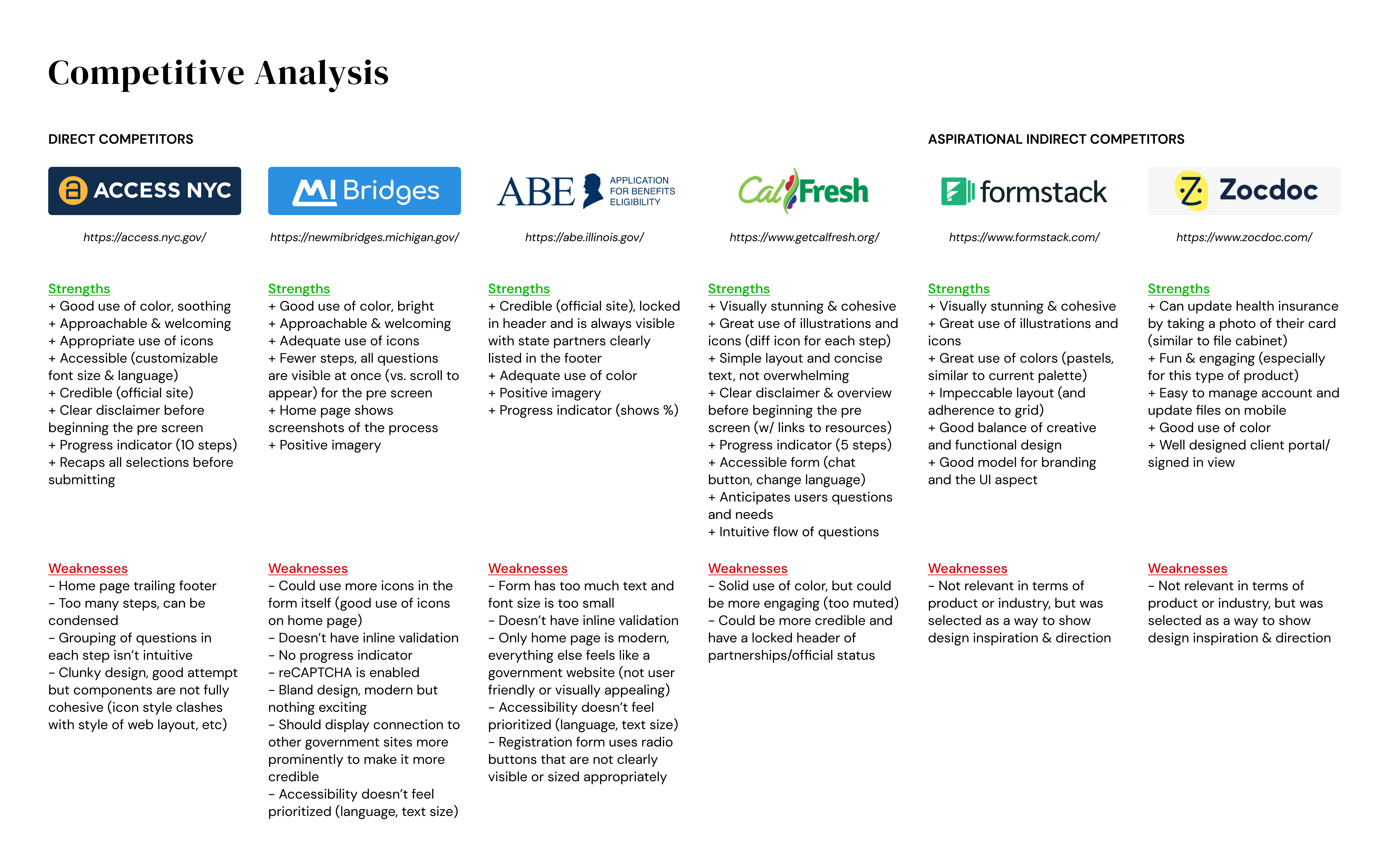
I started with the competitive analysis to get a sense of the market and see if similar companies had accessibility standards in place. I found four direct competitors (only two incorporated accessibility into their websites, Access NYC & CalFresh) and two indirect competitors that possessed specific design patterns I wanted to incorporate and use for inspiration (Formstack for its overall UI/use of color and illustrations, and Zocdoc for its camera uploading feature).

For my primary research, I gathered 7 participants who I thought best fit the vulnerable population demographic Prefix aimed to target, given the limitations of my own social network. These individuals for the most part made a low-to-average living (common thread being finances), but differed in almost all other categories. I wanted to get a diverse set of backgrounds in regards to their ethnicity, education, family/number of dependents, geography, age and sexual orientation, mainly to see if there were any commonalities among opposite ends of the spectrum, or in other words, universally preferred design patterns.
.jpeg)
It was useful to complete the competitive analysis prior to conducting the interviews because I showed each participant the 4 direct competitors and asked them to rank the websites in relation to Prefix. CalFresh was the unanimous winner because it was concise, visually appealing, trustworthy and straightforward. Prefix (and the benefit provider, Wildfire) came in 3rd place because the site felt "sterile" and didn't successfully embody the 4 attributes listed above for CalFresh. On the bright side, participants thought Prefix had a good foundation and room for growth since the big issues revolved more around UI than UX. I subsequently surveyed design patterns with my participants to see if there were any general trends for forms and buttons (see below image, on the right). Overall the results from my research proved to be extremely informative, in that there was a strong desire for:
- UI - more visuals and emphasis on design (color, graphics, etc)
- Trust/Security - more credentials or ways of building trust with the user
- Mobile-first solution
- Prompt Feedback - inline validation, questions loading one at a time, loading data from previously answered questions to reduce repetition
- Transparency - more concise and clear text
.jpeg)
PHASE 3: ANALYZE
From here, I created two personas. I had initially only planned on making one, but my research showed that the vulnerable populations Prefix was targeting was rather hesitant about applying for benefits (possibly because they had become accustomed over time to their financial situation), whereas people who were slightly more well-off but experienced a large and sudden hit to their finances felt more urgency and motivation to return to their previous lifestyle. The latter is depicted by The Breadwinner in Panic Mode, while the original persona is depicted as The Single Parent at Wit's End (detailed below).

Because of the nature of this project, I didn't necessarily need to build a user flow or task flow. My assignment was to demonstrate the entire flow from landing on the homepage to checking eligibility to filling out an application to uploading documents, and since a prior version of the site already existed, I modeled my design and flow off of that. I did create a sitemap though to keep myself organized and it helped because I ended up restructuring one component (the Required Documents page). Originally the Required Documents page showed up after the eligibility pre-screen, but I got feedback that this broke up the momentum of the process and would be better suited to be adjacent to the homepage. This way, users could see what documents would be needed and prepare everything beforehand so that they could complete the application in one go.
.jpeg)
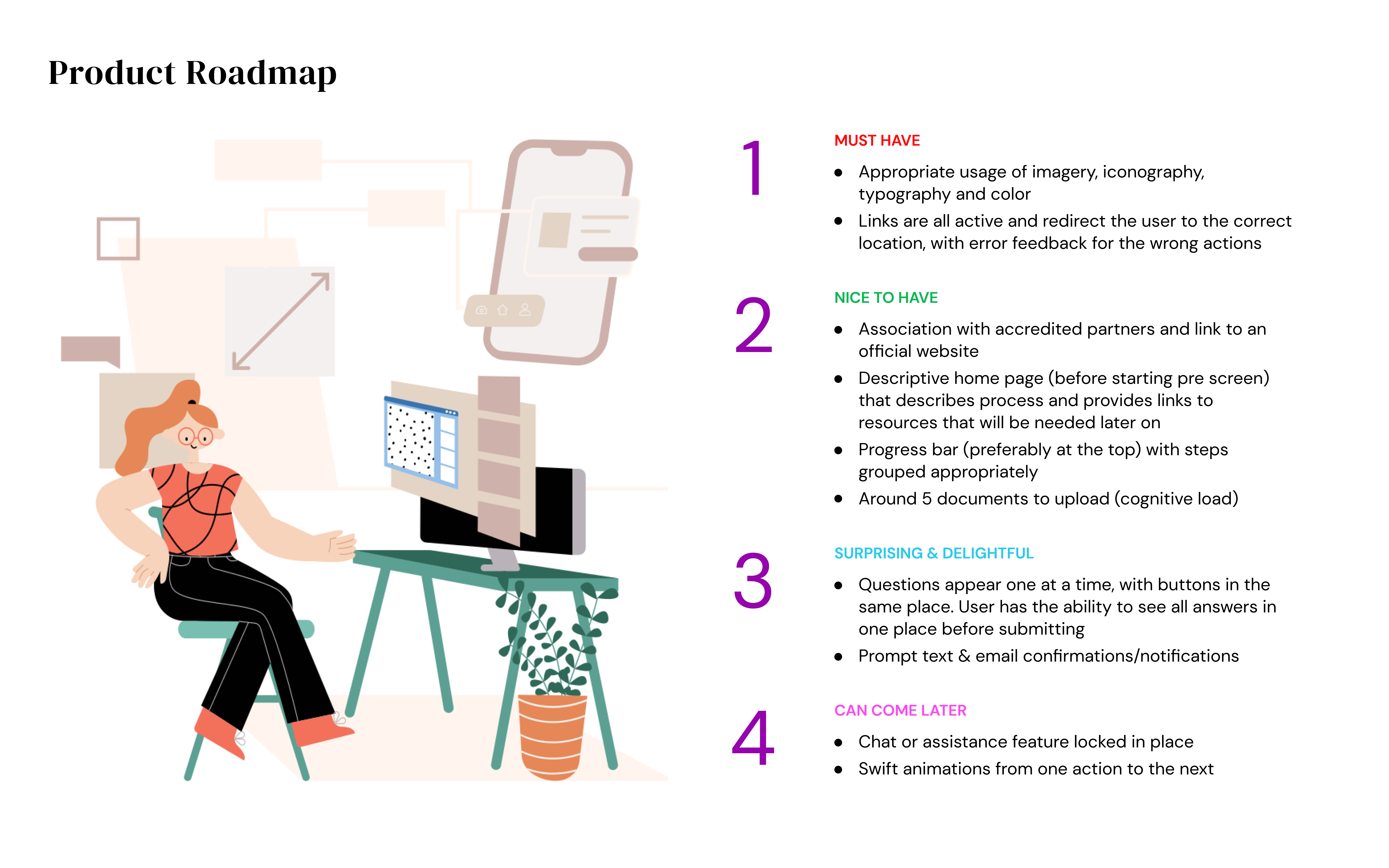
I then built a product roadmap of the key features I would need to include in my design based off of my research findings. I listed them in order of importance, with high priority items being listed at the top and lower priority items being listed at the bottom.

PHASE 4: DESIGN
Using the same layout as my product roadmap, I began thinking about mood boards. For the design patterns (below, on the left) I bolded items from my product roadmap and showcased design inspiration for those points. I then followed a similar structure for my brand mood board but changed the content in the numbered section, while still having items bolded with corresponding samples on the left.
.jpeg)
It was evident to me that participants were drawn to simplicity/ease, transparency and appealing & trustworthy visuals, so I focused on those traits while sketching my wireframes. I wanted to make sure my design incorporated the positive features from the old model and solved the problems of the less desirable features.

I then took my sketches to Figma (versus Sketch because the client had been using Figma and I wanted to make the transfer as easy as possible). I created low fidelity wireframes and focused mainly on the accessibility component and layout on the home page and required documents page. In my first version (below, left 2 screens) I struggled with the placement of text and kept running into the issue of visual clutter/information overload. In my second version (below, darker slate grey screens) I started using cards, which helped condense the text, break up the page into discernable sections, and provide relief to the eye.

Transitioning into high fidelity wireframes, I knew that one of the big accessibility issues would be color. How would I balance creating something visually appealing and engaging while adhering to such strict rules about color contrast ratios? I employed the use of several apps and websites, including Contraste (app), HexNaw (website) and Stark (Figma plugin), among others. I modified Prefix's existing color palette based off the colors on their website and made sure that they were all compliant with AA standards. In fact, all the main colors except the lighter blue were AAA compliant, but because Prefix's logo used both a light blue and a darker navy, I wanted to make sure those colors were still being used throughout the new site to maintain consistency.

I had also done a lot of research about accessible form and button design, which is why all the forms in my final UI design have instructions above it, sample text inside it, and different outlines based on its state (active, filled in, disabled, error, etc). In addition, I rounded the edges of all the forms to make it seem more approachable and friendly, versus harsh or rigid. Since applying for financial aid during a crisis like COVID-19 can be stressful for the user, I wanted to liven up the experience and make it feel less like a government website (ie. DMV, state unemployment site, etc). The illustration style further builds upon that concept and was specifically chosen to comfort, excite and satisfy the user who is likely going through a hard time.

PHASE 5: TEST & ITERATE
After creating 3 versions of my high fidelity wireframe, I created a usability test plan to to get feedback on my designs. I was able to sit down with 4 individuals and received comments from 11 people, for a total of 15 individuals. In my usability testing, I found that certain issues kept getting brought up:
- Who is providing the service? Relationship between Prefix, Wildfire, and City of Phoenix is unclear
- Provide instructions, spell out acronyms, and clean up the text to make it more concise and clear
- Add more to prove legitimacy and gain user's trust (official logos, text detailing security measures, etc)
- Change the header - text size and language would only be set one time, so it's not necessary on every page
- Add more contact info and resources for user to get in touch (email addresses, phone numbers, etc)
- Show that work is being auto-saved

After gathering and analyzing all the comments, I made a few changes, including:
- Back/Next buttons - they were too eye-catching as buttons so I changed it to text only
- Yes/No buttons - were red and green (both active states), so I changed the default to white with a black outline, that would show color upon hovering/clicking
- Changed header to include a phone number instead of the accessibility features (language & text size). Put those in the menu instead
- Modal windows were not consistently communicating the same message, so changed the colors for the upload windows vs. prescreen windows
- Condensed cards by placing text next to icon, rather than underneath
- Modified text on home page and made clickable links orange
- Changed Required Documents page to match layout on home page (white and blue background sections versus all blue background)
KEY TAKEAWAYS & NEXT STEPS
This project was unlike others I have worked on in the past due to the accessibility component and the level of detail required for every touch point. I created hundreds of screens in total showing active/inactive states, hover states, and more.
Next steps for this project would be to take the interaction design to the next level and determine how one would move through this process in real time. The "Upload" portion of the registration process is the most detailed and time consuming, so figuring out how to do an interactive demo on uploading documents would probably be useful. A lot of those features would need to be discussed with an engineer, however, to see what is possible and realistic, so teaming up with them while moving forward would be the ideal plan of action. Further down the road, we would need to build out a desktop version of this mobile product, since some people still prefer using their computer for applications of this nature, along with a portal for the case workers (desktop only).


.svg)


